Toraguard
A cybersecurity brand with tiger focus
The Client
Business Name: Toraguard
Industry: Cybersecurity Consultancy
Toraguard offers boutique cybersecurity consultancy services, specialising in identifying vulnerabilities and strengthening system resilience for mid-to-large enterprises. Inspired by its name (“tora” is Japanese for tiger), Toraguard’s ethos embodies vigilance, agility, and strength. The brand protects clients in an ever-evolving digital landscape, delivering tailored solutions to meet their unique cybersecurity needs.
The Brief
Objectives: The project aimed to establish Toraguard as a premium boutique cybersecurity provider, appealing to larger corporate clients. It focused on creating a brand identity that embodies the tiger’s strength and precision while exuding professionalism and trustworthiness. Additionally, the goal was to develop a cohesive visual identity for digital and print materials that would be scalable as the business grows.
Scope: The scope included designing a logo and visual identity, developing typography, colour palette, and iconography, and applying the branding consistently across digital and print touchpoints.
The Challenge
Toraguard needed an identity that stood out in a competitive field, balancing professionalism with a dynamic, modern aesthetic. The brand’s inspiration, the tiger, had to be integrated subtly to convey focus and vigilance without being overtly literal. The identity also had to resonate with mid-to-large enterprises, projecting authority, agility, and reliability.
The Process
Discovery Phase: Through detailed collaboration with the Toraguard team, we explored the brand’s vision, values, and competitive landscape. The tiger's qualities, sharp focus, strength, and agility, formed the conceptual foundation for the design.
Concept Development: We designed a logo inspired by the “eye of the tiger,” symbolising sharp focus and vigilance. Complementary design elements, including gradients and typography, were crafted to evoke trust and sophistication.
Design Refinement: The final identity seamlessly combined bold geometric forms with a refined colour palette, balancing the technical and human elements of cybersecurity.
The Solution
Logo Design: A sleek, abstract representation of the tiger’s eye, embodying focus, strength, and vigilance.
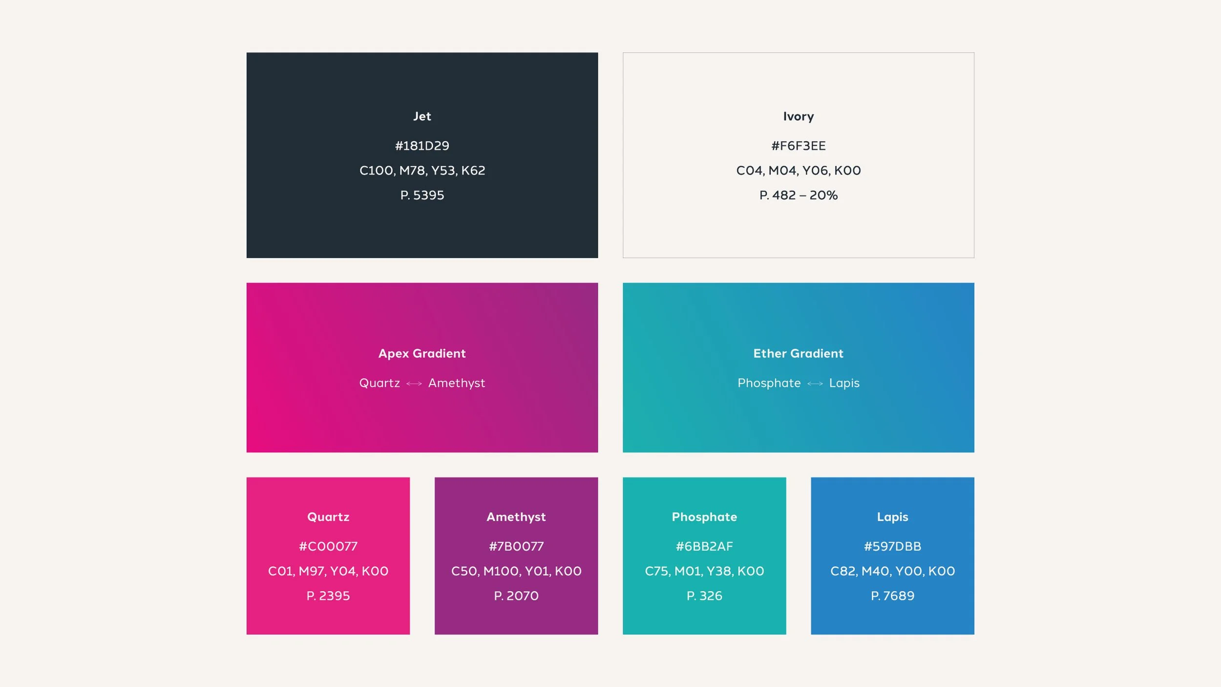
Color Palette: Deep blues for trust and reliability, accented with dynamic purples and pinks to convey energy and modernity.
Typography: A combination of Sora for headers and Halcom for body copy ensures clarity, professionalism, and a modern feel.
Visual Identity: Cohesive elements, including tiger-inspired iconography and contemporary gradients, are applied across all brand materials.
The Impact
Brand Recognition: The tiger’s eye marque is a distinctive and memorable symbol of Toraguard’s focus and expertise.
Professional Presence: The cohesive visual identity enhances Toraguard’s appeal to corporate clients, establishing trust and authority.
Versatile Application: The brand has been successfully implemented across digital platforms, print collateral, and branded merchandise.
Website: www.toraguard.com
If your brand needs a fresh look to stand out and connect with the right audience, we’d love to help! Drop me a message or book a Discovery Call to start your brand journey today!


