Blush Beauty
A Relaxing Retreat with a Refined Brand Identity
The Client
Business Name: Blush Beauty
Industry: Beauty and Wellness
Blush Beauty is a small, high-street salon in Mayfield, East Sussex, that offers a luxurious spa experience with high-quality treatments and products. Known for its friendly atmosphere and excellent service, Blush Beauty creates a safe space where clients can relax, recharge, and leave feeling refreshed and confident.
The Brief
Objectives: The project aimed to craft a cohesive brand identity that reflects Blush Beauty’s core values: friendliness, professionalism, and creativity. The new identity needed to highlight their unique selling point of personalised, high-quality service in a comfortable and affordable setting, appealing to their loyal local clientele and potential new customers.
Scope: The scope included designing a logo, establishing a colour palette, typography, and imagery, and ensuring these elements are applied consistently across all touchpoints, including social media, printed materials, and in-salon signage.
The Challenge
Blush Beauty required a brand identity that stood out in a competitive beauty market, showcasing their attention to detail and commitment to client satisfaction. The challenge was to combine the elegance of a high-end spa with the warmth and approachability of a local business.
The Process
Discovery Phase: Through detailed conversations with Ashleigh, Blush Beauty’s owner, we uncovered the salon’s ethos: making every client feel positive, refreshed, and cared for. This insight informed the design direction.
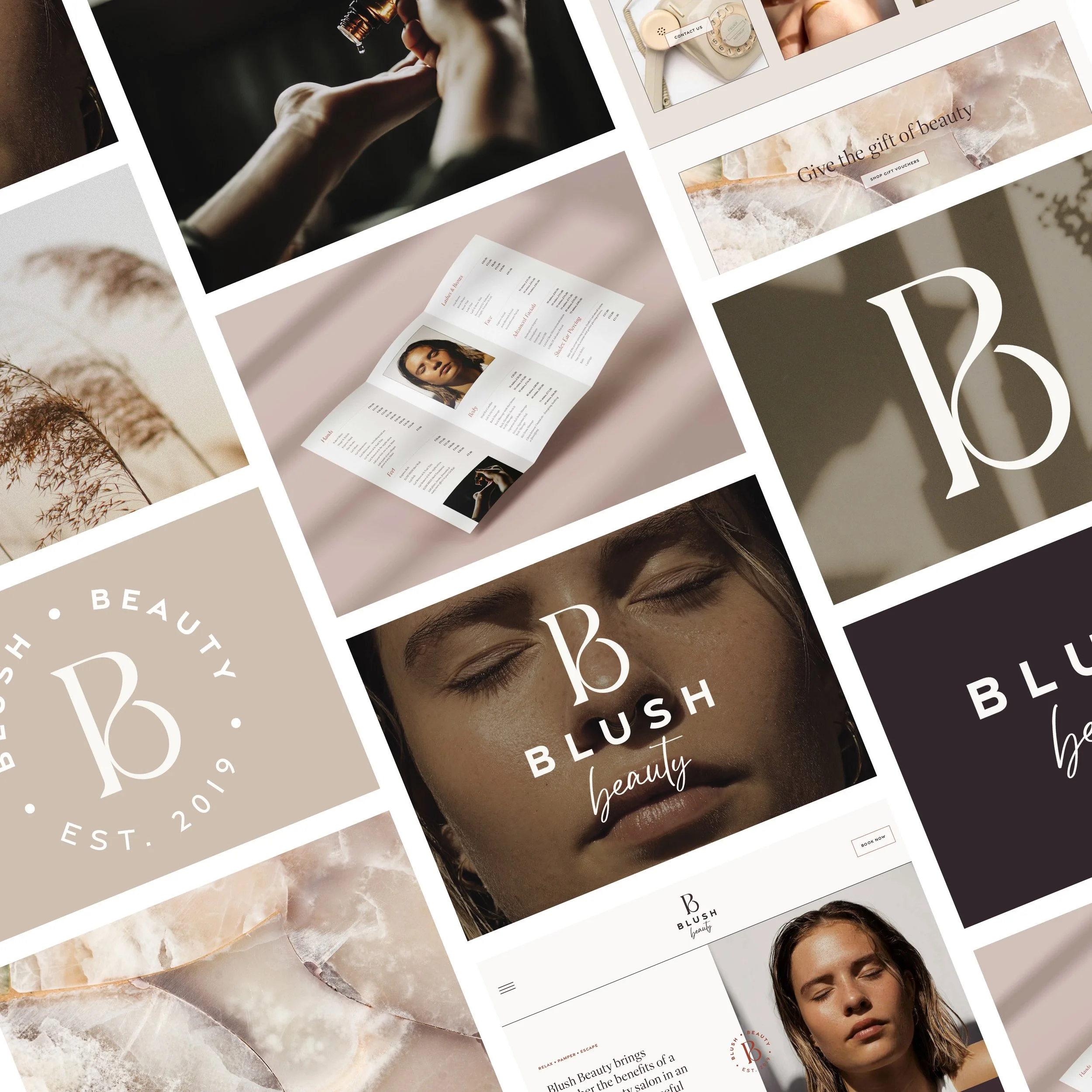
Concept Development: The logo concept drew on minimalist design principles, using soft curves to reflect comfort and care. The blush and espresso colour palette was chosen to evoke luxury and warmth, while the typography combined classic and modern styles to balance professionalism with a friendly tone.
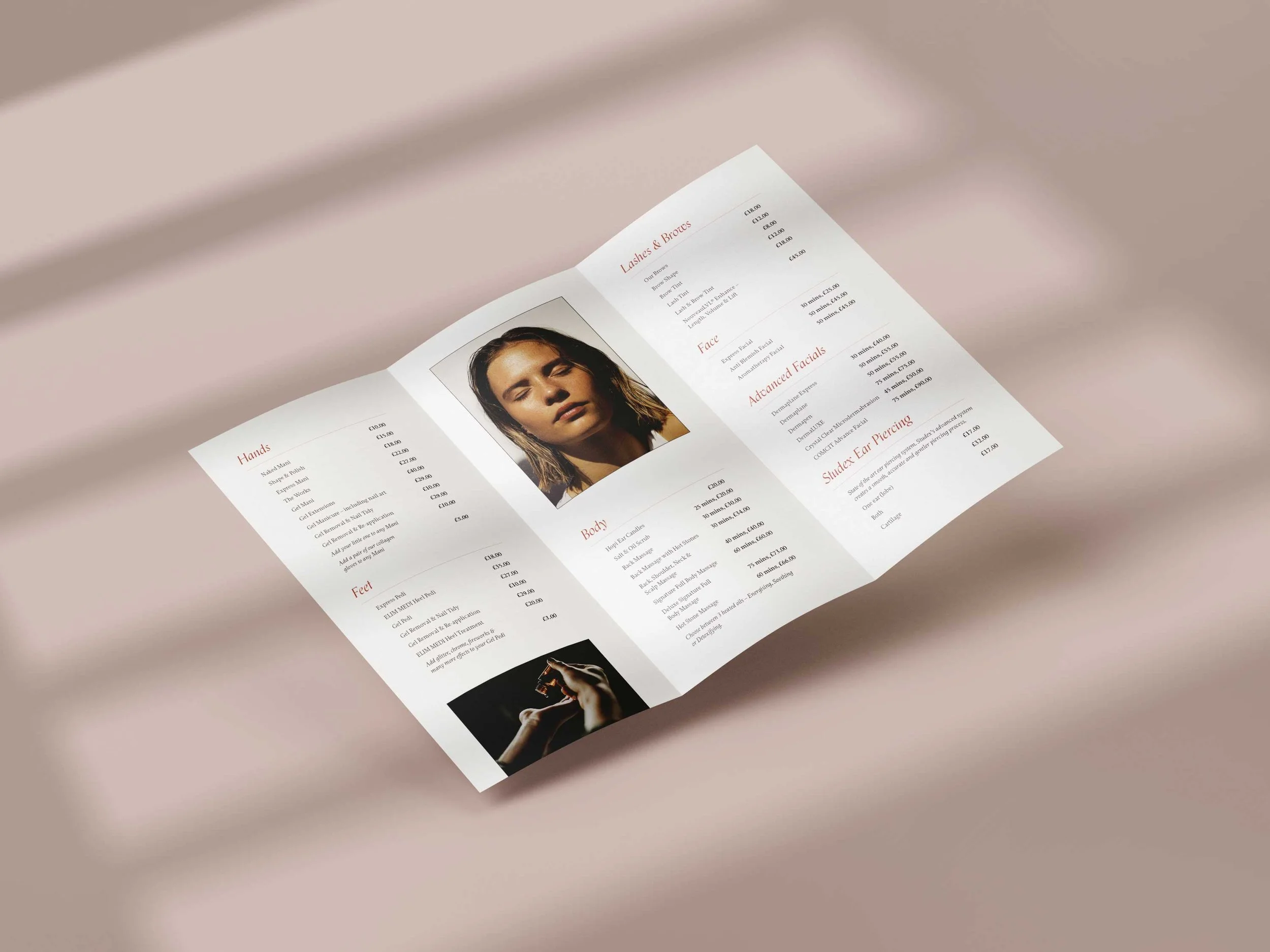
Design Refinement: The final identity used cohesive design elements, including graceful typography, soft gradients, and serene imagery, to create a polished look that feels inviting and indulgent.
The Solution
Logo Design: A clean, elegant logo featuring soft curves and sophisticated typography to represent relaxation and quality.
Color Palette: Warm tones like blush and latte paired with deep espresso, symbolising luxury and comfort.
Typography: Proforma Book and Orpheus Pro Regular for a balance of readability, elegance, and creativity.
Visual Identity: High-quality imagery showcasing serene, spa-like moments and product shots that highlight quality.
The Impact
Brand Recognition: The polished, cohesive branding enhances Blush Beauty’s professional image and appeal.
Client Loyalty: A consistent and inviting visual identity reinforces trust with existing clients and attracts new ones.
Differentiation: The refined design clearly sets Blush Beauty apart from competitors, emphasising care and quality over speed.
Blush Beauty’s new identity reflects their dedication to making every client feel special and rejuvenated.
Website: www.blushbeautyofmayfield.com
If your brand needs a fresh look to stand out and connect with the right audience, we’d love to help! Drop me a message or book a Discovery Call to start your brand journey today!


